Building Renovate AI’s design system
A token-first design system that lets a small team ship consistent product to 1M+ users across web and mobile, and keeps AI-built work on-system too.
Company
Renovate AI
Role:
Senior Product Designer, system owner
Platform:
Web and mobile
Timeline
May 2024 – present
Scale
1M+ users
Key decision
Token-first, and readable by the AI that builds with it

01
Overview
I built and own Renovate AI’s design system from scratch: the web and mobile foundation for an AI-first home-renovation product with 1M+ users. It exists so a small team can ship fast without remaking the same decisions, and so the AI tools we build with stay inside the same rules as the people.
It’s token-first, not a component sticker sheet. One change to a token reaches every screen that uses it, which is why a full rebrand took days instead of a redraw of every component.
Today it holds 35 component sets with 507 variants, 96 tokens (83 colors in light and dark, 13 for type), and 22 text styles.
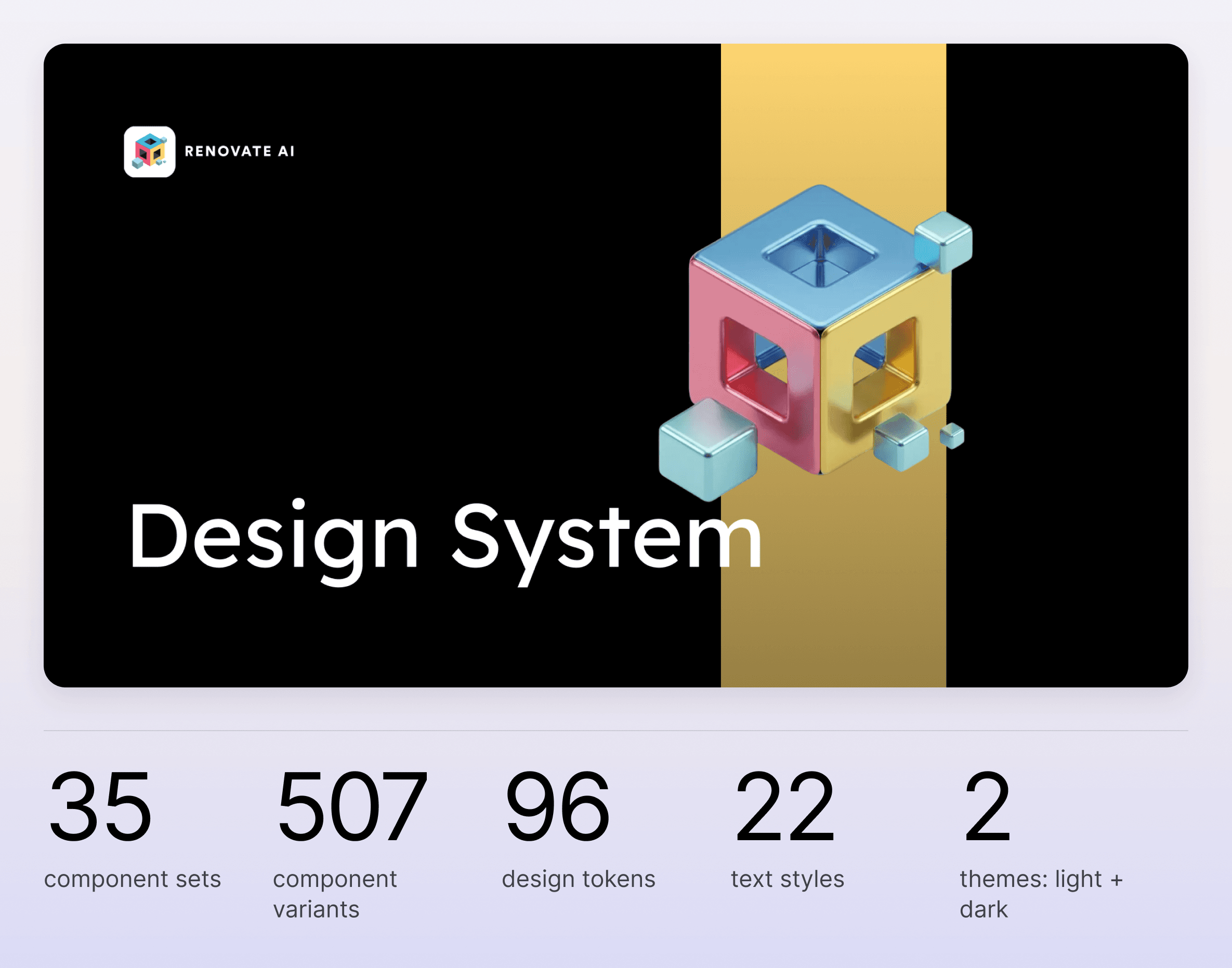
The system at a glance: 35 component sets, 507 variants, 96 tokens, 22 text styles
02
The problem at scale
As Renovate AI grew across web and mobile, UI decisions were being remade feature by feature. Spacing, color, and components drifted every time, which slowed shipping and diluted the brand for 1M+ users.
My audit of just one pattern, the mobile header, found 7 screens with 4 recurring inconsistencies and 3 different back-chevron styles. Consistency depended on someone catching it in review, and with a lean team shipping fast on an AI product, that doesn’t hold. The system had to make the right choice the easy one, including for AI-assisted work.

My audit of the mobile header across 7 screens: 4 recurring inconsistencies
03
Architecture
The system is token-first and layered, so a single change propagates instead of being re-applied by hand.
Primitives: brand blue #1570EF and its scale, a gray scale, Inter on a 1.25 type scale (10 to 39), and a 4-based spacing scale from 4px to 256px.
Semantic tokens: primitives mapped to intent, like main-colors/primary, Text-colors/text-base, Layout/surface-base, and Layout/surface-raised, each with a light and dark value.
Components: 35 sets, including buttons, inputs, cards, modals, toasts, tags, toggles, and pills, that consume semantic tokens only.
The semantic layer is what makes rebrands cheap. When the brand moved from purple to blue, main-colors/primary was repointed to #1570EF and every component followed, with no redraws.

Primitives, semantic tokens, and components, with the real token names

A slice of the component library: buttons, inputs, toggles, pills, and toasts
04
Figma and code, in sync
I design the tokens and components, and I work in the code that consumes them. A token isn’t done when it looks right in Figma; it’s done when the same value is live in the product.
Every value has a code name: specs list the token engineers reference, like --header-glass-circle or --color-brand-blue, so handoff is a lookup, not a translation.
No hardcoded hex values: the rule in the file’s own docs. Theme switching happens at the variable level, never per component.
Synced, not copied: I sync tokens straight into the codebase with Claude Code in the terminal, so designers and engineers prototype and ship from the same tokens.

Tokens and measurements from the mobile header spec, each with the CSS token that carries it
05
Governance and adoption
I made the system self-enforcing, so consistency didn’t depend on me reviewing every screen. A system is only real once other people, and tools, build with it without being told to.
Rules live next to the tokens: each semantic token documents what it’s for and what it isn’t, like “if it casts a shadow, it uses surface-raised.”
Engineers build from it directly: every spec names the CSS token that carries each value, so engineers pull tokens by name and ship from the same source I design in, without a translation step.
A brand guardian for AI-assisted work: a Claude skill grounded in the Figma tokens, with approved vocabulary, Responsible AI rules, and visual floors (#1570EF only, Inter only, 4-based spacing), checked against a 20-point list before anything ships.
Adopted through real features: Refine, Screenshot Share, folders and projects, watermarking, and the enterprise landing page all shipped on it. New features start from the system by default.
One pattern, end to end: the mobile header went from 7 inconsistent versions to one pattern with an anatomy, 6 approved variants, interaction states, tokens, and a first-match decision guide.

Excerpt from the renovate-ai-guardian Claude skill
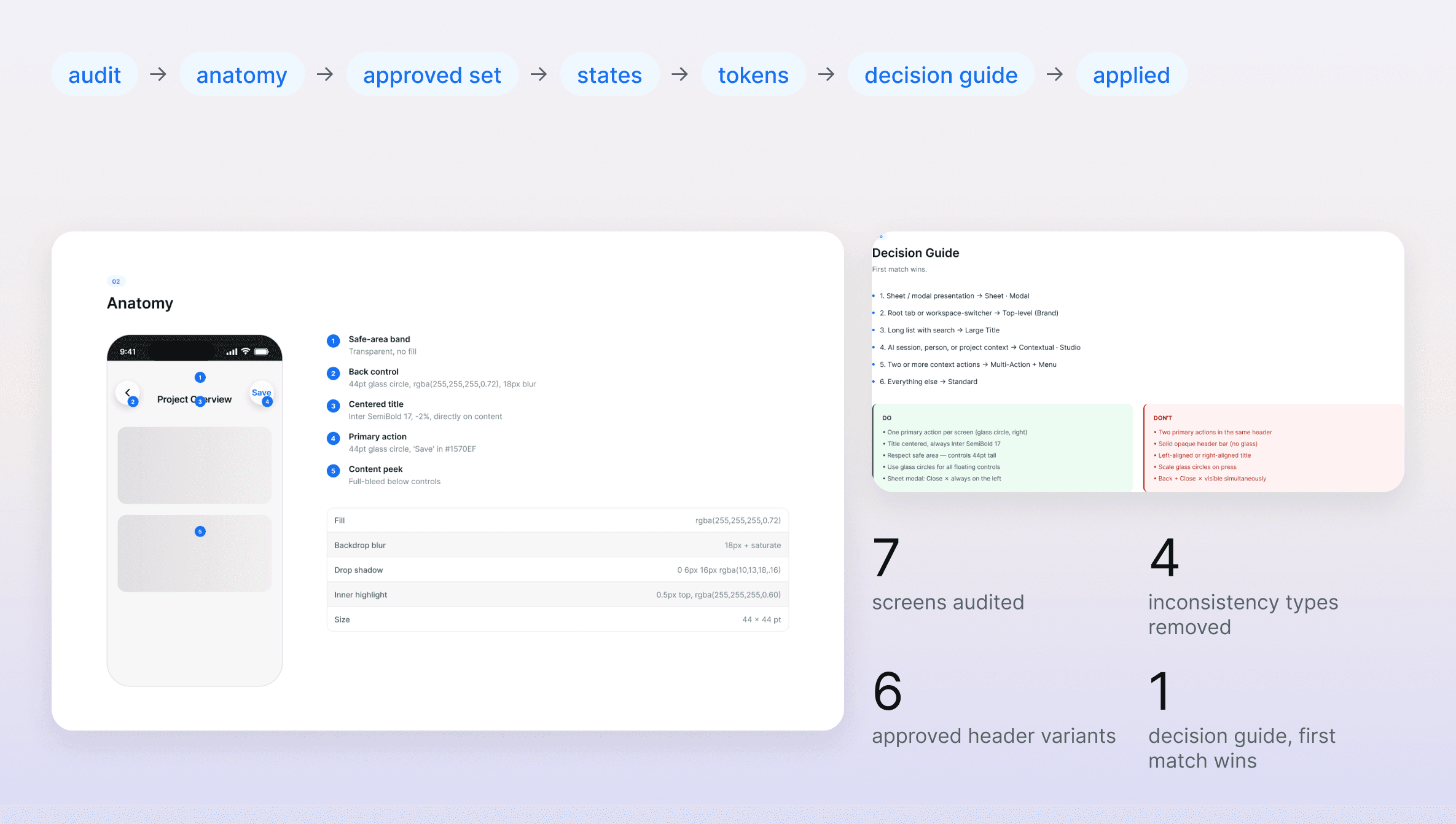
One pattern, specified end to end: the mobile header system
06
Accessibility
Accessibility lives in the tokens, so it scales with the system instead of being retrofitted screen by screen.
Contrast on every swatch: each color is labelled with its WCAG 2.2 contrast ratio, so whoever picks a shade sees whether it passes AA or AAA before it ships.
States defined once: focus, error, and disabled states live in the component library, not in each feature.
Touch targets: header controls are specced at 44 × 44 pt, the minimum comfortable touch target.

Every color scale is labelled with its WCAG 2.2 contrast ratio
07
Designing for AI
Renovate AI is AI-first, so the system had to do two things most design systems don’t: define patterns for AI features, and be legible to the AI itself. Both are running in production, not planned.
Patterns for steering a model: Refine went through 10+ rounds and landed on inline chips, like “Help me describe” and “Improve description,” as a reusable way to steer the model’s output.
Compliance checked by the AI, not by me: the brand-guardian skill reviews AI-generated UI and copy against the tokens and the 20-point list, down to vocabulary: users edit images, RAI displays them. Review that used to need a designer now happens before the work reaches one.
Tokens the AI can read: because tokens are synced into the codebase with their names intact, an AI coding tool builds with the same values a designer would pick.
Trust in AI output: watermarking on AI-generated images, and disclosure rules for anything a user might mistake for human work.
I don’t just design for AI features; I encode the design system into the AI.
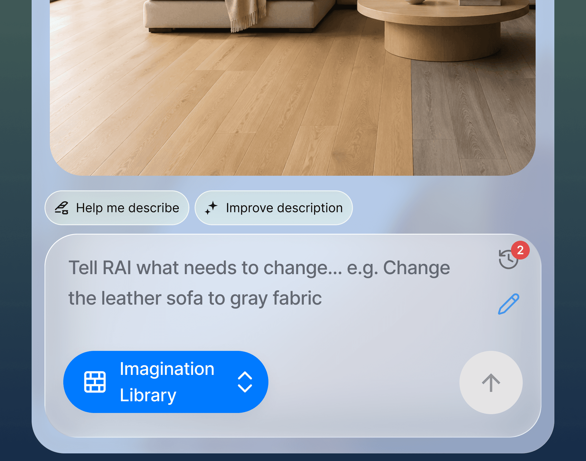
Refine’s inline chips: Help me describe and Improve description
08
Impact
What the system made possible, in two groups. The first comes from the system itself. The second came from product work built on it, so the system is one contributor to those results, not the sole cause.
Speed and cost
Rebrand: purple to blue across web and mobile in a matter of days, by repointing one token, with no component redraws.
Reuse: 507 component variants across 35 sets, on 96 tokens, so new features start from existing parts.
Consistency: 7 inconsistent mobile headers replaced by one specified pattern.
Growth and quality
Scale: one system serving 1M+ users across web and mobile.
Conversion: +23% onboarding-to-paid after an onboarding redesign built on the system.
Quality: Play Store rating from 2.1 to 4.5 in 6 months, and subscription conversion up 77% within a year, after mobile UX work on the system.

Impact at a glance
09
Reflection
I started with one pattern, not a full library. Auditing the mobile header and fixing it end to end proved the approach before I asked anyone to adopt a system, and I’d start that way again.
The part I underestimated was how much the documentation would matter once AI tools entered the workflow. Rules written for people turned out to be exactly what a model needs to stay on-system.
What I’d do differently is measure the system itself from day one. I can count what it holds, but not yet how much time it saves, and the conversion and rating gains belong to the product work built on it.
Next is closing that gap: tracking how much of the product is built from system components, and how long a feature takes with it.