I designed an AI mascot. Then I gave him a job.
I designed an AI mascot. Then I gave him a job.
I designed an AI mascot. Then I gave him a job.

I published this article on Medium. It covers the design process behind an AI mascot, why it needed more than personality, and how giving it a real product job changed the direction of the work.
Read the full article
The full post is available on Medium: I designed an AI mascot. Then I gave him a job.
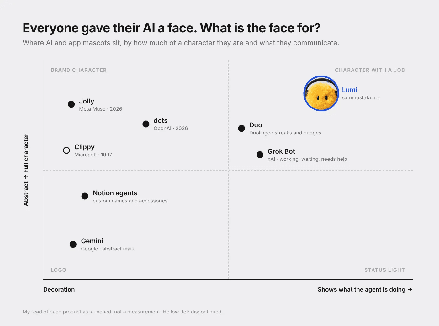
What Jolly and dots get right, what they skip, and what I learned building my own

In September, the AI agents got faces. Meta launched its Muse agent on September 8 and gave it Jolly, a fuzzy little egg with pink cheeks, a few weeks later. On September 29, OpenAI walked onstage at DevDay with dots, a crew of colorful characters in berets and bow ties. Overnight my feed went from “agentic workflows” to “look at this little guy.”
It’s easy to write this off as marketing, and partly it is. But the timing says something.
Mascots show up when the ask gets bigger
A chatbot only needs your question. An agent wants your inbox, your calendar and sometimes your card. A friendly face is the fastest way to make a big ask feel small.
The risk is that the face covers what’s actually happening. While I’m looking at a cute blob, I’m not looking at what it can read, what it remembers or what it’s about to buy. Charm makes those questions easier to skip.
So I use one test for any mascot, the same test I’d use for any UI element: if you removed it, would the user lose information? If not, it’s decoration.
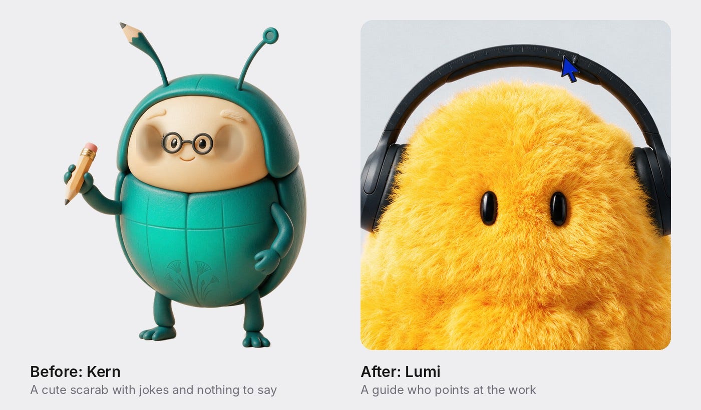
Lumi, version one: a cute scarab with nothing to say
I wanted a mascot for my portfolio, so I tried it myself. The first version was a teal clay scarab with round glasses, a pencil and a lotus on his shell. His eyes followed your cursor, he ducked when you got close and stared when you went idle. Click him and he’d crack a joke like “Spacing’s off by 4px. I fixed it.”
People enjoyed him for about ten seconds. Then he had nothing left to offer. By my own test, he failed: remove him and you lose nothing.
Press enter or click to view image in full size
Writing the brief before the character
So I stopped designing what he looked like and wrote down what he was for.
Lumi became my design alter ego: a senior designer sitting next to you, saying “you might want to look at this.” He knows which part of the site you’re on. He advocates for the work without selling it. His voice is direct, observant and a little dry.
And one rule mattered more than the rest: he only speaks when there’s something worth saying. Silence is often the right call.
I also decided against a live AI chat. Every line is hand-written. That means nothing can go off-script, nothing can make up a claim about my work, and there’s no backend to break.
Making him useful
Lumi now lives on every page of my site, with about 23 lines, each tied to a specific section of a case study. A line only plays after you’ve stopped on that section, so it lands while you’re actually reading.
Every line comes from real project content. If you pause on the research section of my Refine case study, he points out that drop-off stayed near 60% even after users gave a thumbs up. A good result wasn’t enough, which is why the help had to come before the render. That’s the detail I’d want a hiring manager to notice, and now someone points at it.
Restraint is built in:
Each line plays once per visit.
At least 40 seconds pass between lines.
At most 2 lines per page and 5 per visit.
On phones he stays quiet unless you tap him.
I also cut a line that just repeated a pull quote already on the page. If he’s restating what you can already see, he’s noise.
Then I followed the trend, and had to make him mine
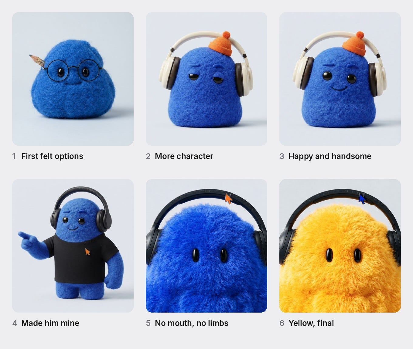
Once he had a job, I redesigned how he looked, and I’ll be honest: I started from the dots reference. Two rounds of options later I had a cobalt character in headphones, and he still felt generic.
So I asked what would make him unmistakably mine. The answers were small and specific. I wear black basics and black Sony headphones. I trained as an architect, and I want that to show quietly. I live in Figma, not in a sketchbook.
Those became his details: matte black headphones, scale-ruler tick marks on the headband, and a cobalt cursor arrow clipped to it. I removed his mouth and limbs to make him less human, then made him yellow. The pin had to switch from orange to cobalt, because orange disappeared against yellow fur.
Yes, a fuzzy yellow blob looks like it belongs in the same family as Jolly and dots. That’s partly the point. I wanted to see what happens when you take the trend’s look and make the character earn it.
Press enter or click to view image in full size
No mouth means motion does the talking
When I saw the yellow version in place, my reaction was that he seemed sad. Without a mouth, a static character has no way to show mood.
Motion fixed it. He breathes with a slow sway from his base. His eyes curve into happy arcs when your cursor comes near or when he starts talking. He hops with a little squash on landing. A slowly approaching cursor gets a greeting instead of a retreat, and only a fast swipe makes him flinch. If you’ve turned on reduced motion, the sway and hops switch off.
Where AI helped, and where it didn’t
I built Lumi with Claude, mostly from the terminal. AI generated the design rounds, cut his artwork into layers, wrote the component and handled the Framer publishing.
It also broke publishing once. Renaming a code file left my pages importing a file that no longer existed, which produced 12 errors on publish. The fix was to put the old name back and rebuild. That’s the job in miniature: AI makes it fast to get something that looks finished. Knowing whether it’s actually right, from what he says to when he stays quiet to why he looked sad, was still the design work.
What I’d tell anyone designing an AI character
Write the brief before you draw the face. Decide what the character is for first.
Give him real information. A mascot should point at something the user would otherwise miss.
Design the silence. Limits on how often a character speaks matter as much as what it says.
Make it yours with specifics. Generic inputs give you a generic character. Small personal details are what make it recognizable.
Never let charm hide consequences. For an agent, the cute moment and the “this will spend money” moment should never look the same.
Jolly and dots will be judged on whether the agents behind them actually do the job. Lumi will be judged on whether my work holds up. The face gets people in the door, and the work has to keep them there.
Lumi lives at sammostafa.net. Best on desktop. Stop on a case study and see what he has to say.
I published this article on Medium. It covers the design process behind an AI mascot, why it needed more than personality, and how giving it a real product job changed the direction of the work.
Read the full article
The full post is available on Medium: I designed an AI mascot. Then I gave him a job.
What Jolly and dots get right, what they skip, and what I learned building my own
In September, the AI agents got faces. Meta launched its Muse agent on September 8 and gave it Jolly, a fuzzy little egg with pink cheeks, a few weeks later. On September 29, OpenAI walked onstage at DevDay with dots, a crew of colorful characters in berets and bow ties. Overnight my feed went from “agentic workflows” to “look at this little guy.”
It’s easy to write this off as marketing, and partly it is. But the timing says something.
Mascots show up when the ask gets bigger
A chatbot only needs your question. An agent wants your inbox, your calendar and sometimes your card. A friendly face is the fastest way to make a big ask feel small.
The risk is that the face covers what’s actually happening. While I’m looking at a cute blob, I’m not looking at what it can read, what it remembers or what it’s about to buy. Charm makes those questions easier to skip.
So I use one test for any mascot, the same test I’d use for any UI element: if you removed it, would the user lose information? If not, it’s decoration.
Lumi, version one: a cute scarab with nothing to say
I wanted a mascot for my portfolio, so I tried it myself. The first version was a teal clay scarab with round glasses, a pencil and a lotus on his shell. His eyes followed your cursor, he ducked when you got close and stared when you went idle. Click him and he’d crack a joke like “Spacing’s off by 4px. I fixed it.”
People enjoyed him for about ten seconds. Then he had nothing left to offer. By my own test, he failed: remove him and you lose nothing.
Press enter or click to view image in full size
Writing the brief before the character
So I stopped designing what he looked like and wrote down what he was for.
Lumi became my design alter ego: a senior designer sitting next to you, saying “you might want to look at this.” He knows which part of the site you’re on. He advocates for the work without selling it. His voice is direct, observant and a little dry.
And one rule mattered more than the rest: he only speaks when there’s something worth saying. Silence is often the right call.
I also decided against a live AI chat. Every line is hand-written. That means nothing can go off-script, nothing can make up a claim about my work, and there’s no backend to break.
Making him useful
Lumi now lives on every page of my site, with about 23 lines, each tied to a specific section of a case study. A line only plays after you’ve stopped on that section, so it lands while you’re actually reading.
Every line comes from real project content. If you pause on the research section of my Refine case study, he points out that drop-off stayed near 60% even after users gave a thumbs up. A good result wasn’t enough, which is why the help had to come before the render. That’s the detail I’d want a hiring manager to notice, and now someone points at it.
Restraint is built in:
Each line plays once per visit.
At least 40 seconds pass between lines.
At most 2 lines per page and 5 per visit.
On phones he stays quiet unless you tap him.
I also cut a line that just repeated a pull quote already on the page. If he’s restating what you can already see, he’s noise.
Then I followed the trend, and had to make him mine
Once he had a job, I redesigned how he looked, and I’ll be honest: I started from the dots reference. Two rounds of options later I had a cobalt character in headphones, and he still felt generic.
So I asked what would make him unmistakably mine. The answers were small and specific. I wear black basics and black Sony headphones. I trained as an architect, and I want that to show quietly. I live in Figma, not in a sketchbook.
Those became his details: matte black headphones, scale-ruler tick marks on the headband, and a cobalt cursor arrow clipped to it. I removed his mouth and limbs to make him less human, then made him yellow. The pin had to switch from orange to cobalt, because orange disappeared against yellow fur.
Yes, a fuzzy yellow blob looks like it belongs in the same family as Jolly and dots. That’s partly the point. I wanted to see what happens when you take the trend’s look and make the character earn it.
Press enter or click to view image in full size
No mouth means motion does the talking
When I saw the yellow version in place, my reaction was that he seemed sad. Without a mouth, a static character has no way to show mood.
Motion fixed it. He breathes with a slow sway from his base. His eyes curve into happy arcs when your cursor comes near or when he starts talking. He hops with a little squash on landing. A slowly approaching cursor gets a greeting instead of a retreat, and only a fast swipe makes him flinch. If you’ve turned on reduced motion, the sway and hops switch off.
Where AI helped, and where it didn’t
I built Lumi with Claude, mostly from the terminal. AI generated the design rounds, cut his artwork into layers, wrote the component and handled the Framer publishing.
It also broke publishing once. Renaming a code file left my pages importing a file that no longer existed, which produced 12 errors on publish. The fix was to put the old name back and rebuild. That’s the job in miniature: AI makes it fast to get something that looks finished. Knowing whether it’s actually right, from what he says to when he stays quiet to why he looked sad, was still the design work.
What I’d tell anyone designing an AI character
Write the brief before you draw the face. Decide what the character is for first.
Give him real information. A mascot should point at something the user would otherwise miss.
Design the silence. Limits on how often a character speaks matter as much as what it says.
Make it yours with specifics. Generic inputs give you a generic character. Small personal details are what make it recognizable.
Never let charm hide consequences. For an agent, the cute moment and the “this will spend money” moment should never look the same.
Jolly and dots will be judged on whether the agents behind them actually do the job. Lumi will be judged on whether my work holds up. The face gets people in the door, and the work has to keep them there.
Lumi lives at sammostafa.net. Best on desktop. Stop on a case study and see what he has to say.